Mercedes-AMG Petronas W10

Mercedes have continued with the recognisably iconic silver, as loved by most fans. However, some were left disappointed after stunning teaser images of a black and green camo livery were posted on social media, hinting towards a big change for the team. The images, posted to focus attention on the livery and away from the car, turned out to only represent a subtle change in colour for the Silver Arrows. Such as, the halo being silver instead of bare carbon fibre, and the Petronas green being sharper to separate the silver from the black, which hides the floor and bargeboards.
Scuderia Ferrari Mission Winnow SF90

Alongside the new design, Ferrari has chosen a matte red finish as opposed to tis traditional gloss finish. The gloss paint, said to be heavier than the darker red matte colour, has been ditched only to save weight. Having gone completely the opposite direction to Mercedes in regard to leaving the colour of the halo in it’s bare carbon fibre finish, seems to have taken away from the previously sleek and clean look of the 2018 car. Furthermore, black wheels would seriously improve the appearance and the black sponsorship text just does not seem to work as well as the white of last season. In the view of Karun Chandhok, Ferrari’s should always be shiny ‘scarlet’ red.
Aston Martin Red Bull Racing Honda RB15

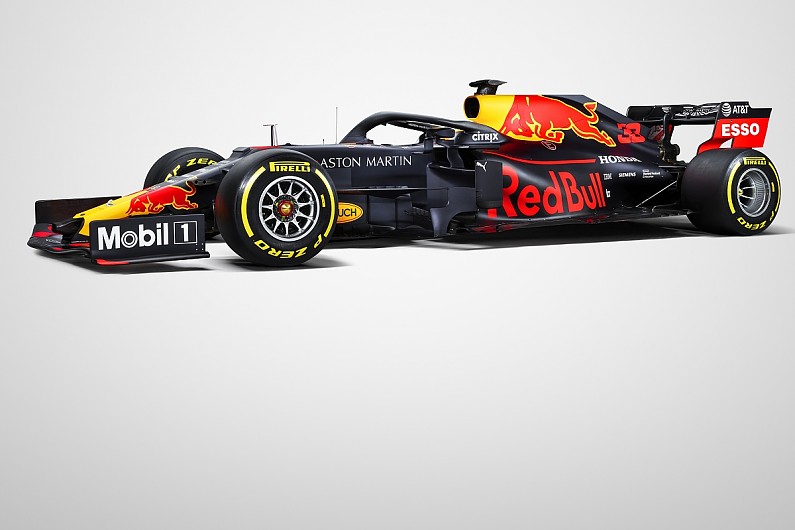
Red Bull Racing compete with an unchanged livery for the 2019 season that includes a matte blue finish and the familiar red and yellow flourishes. The significant difference being the name on the engine cover. The team excited fans, that were hopeful for a change, with the camo livery that never even made it to testing, with an array of red chevrons on dark blue and black covering up aspects of the car design.
Renault F1 Team RS19
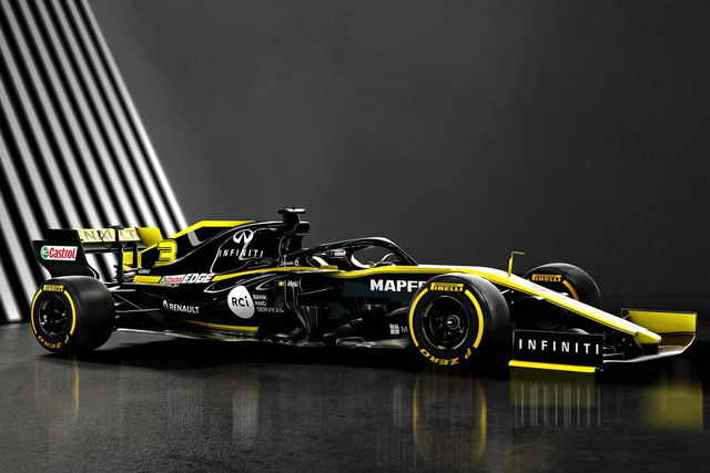
In the case of Renault, a livery that was never broken, has not needed to be fixed. Just a few more highlights of yellow on the front and rear wing and the appearance of the #3 make this livery one of the best of the modern era.
Rich Energy Haas F1 Team VF19
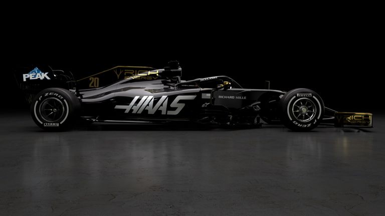
A cash injection from a relatively unknown energy drinks company has meant an all new livery for the all- American team. A lack of sponsors and perhaps a lack of Lotus-style gold on the shiny black background means that this look could have been better. A ‘disappointment’ is the best description.
McLaren MCL34

McLaren’s livery is a strange one… one that keeps the papaya orange of last season (a colour not at all linked to success for the team) and teams it with an odd vega blue. Perhaps inspired by Fernando Alonso’s Abu Dhabi farewell livery, the colours don’t quite go together and the mash up of sponsors does not help. Being a fan of the look of last seasons car, I am not quite liking this.
SportPesa Racing Point F1 Team RP19
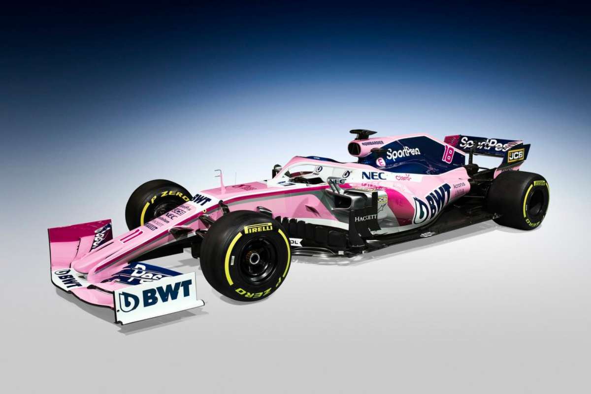
The newly renamed SportPesa Racing Point team keeps the pink BWT and Force India colours but acquires snippets of dark blue SportPesa colours. This is certainly not a car that is easily mistaken with another especially as the livery design itself does seem extremely cluttered and sponsor enforced. The reasoning behind that being the team’s financial and ownership situation of late. However, in an odd fashion, I quite like it.
Alfa Romeo Racing C38

The Alfa Romeo C38 continues the naming philosophy from Sauber but also continues the half white and half red colours from 2018. A higher prominence of the Italian manufacturer’s logo and the darker red engine cover, rear wing and halo harks back to the original Alfa Romeo colours, in a very modern way. However, most possess slight disappointment towards the ‘Valentine’s’ livery of pre-season shakedown being dropped before running in testing.
Red Bull Toro Rosso Honda STR14
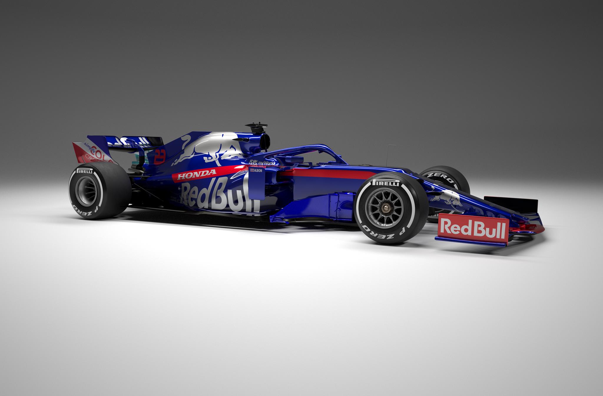
Unfortunately, in some ways, Toro Rosso’s livery remains totally unchanged since 2017. On the other hand, a fortunate commodity in my opinion, as this is the best livery compared to most Red Bull branded cars of the past.
Rokit Williams Racing FW42

Along with the new white, black and pale blue colour scheme, a new title partner ‘ROKiT’ makes their debut in Formula 1, all over the new Williams. The disappearance of Martini from the team signifies the desperation for sponsor money for the team, to ultimately improve the performance. Especially with the differing shades of black, patched along the sides of the car, the pale blue and white simply does not seem to work as a colour combination. The front nosecone displaying a gradual blue to white colour scheme almost looking like flow-vis paint, creates a strange disproportioned design.
I would love to know your favourite looking new Formula One car and livery for 2019, and also your favourite of all time…

Leave a comment